Photos by Sage Bennett
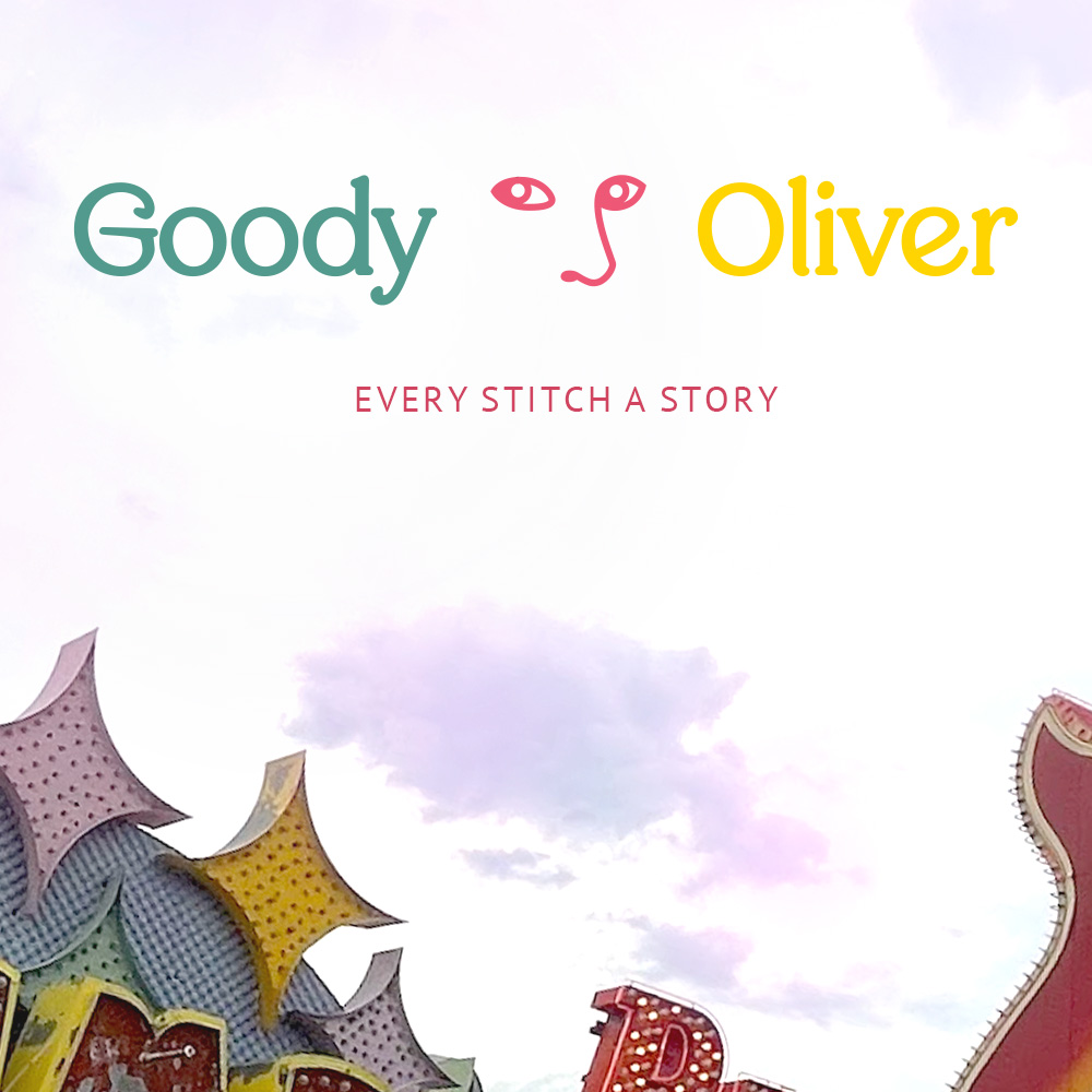
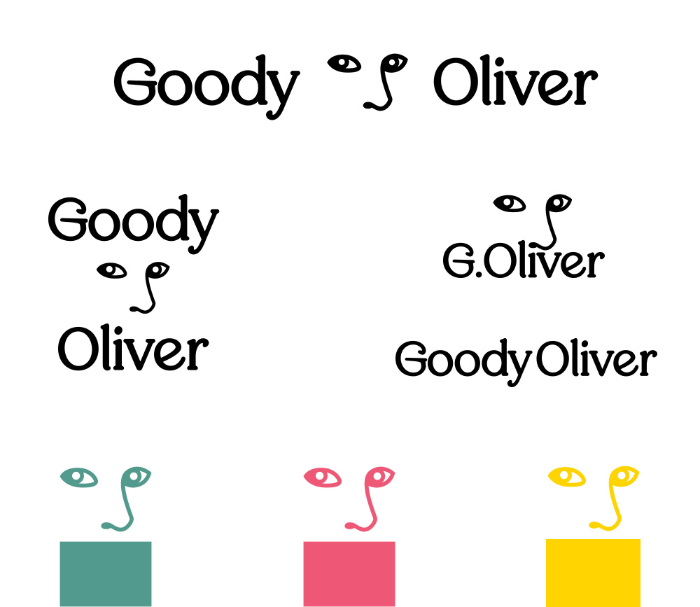
In 2023, an old colleague of mine commissioned a logo and identity package for her hand made fashion startup: Goody Oliver. We wanted to embody a spirit of femininity and DIY, arts and crafts tradition. A mastery of delicate skills that women have traditionally reveled in.
The name is an homage to an old family matriarch, who was regarded as a master seamstress, tailor, and spiritual advisor. Some even called her a witch, but no one could call into question her wisdom and experience.
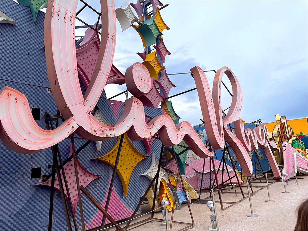
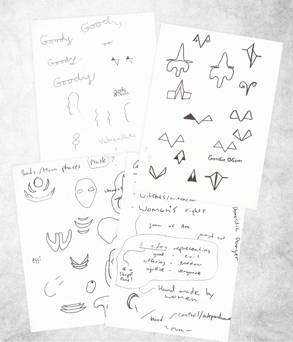
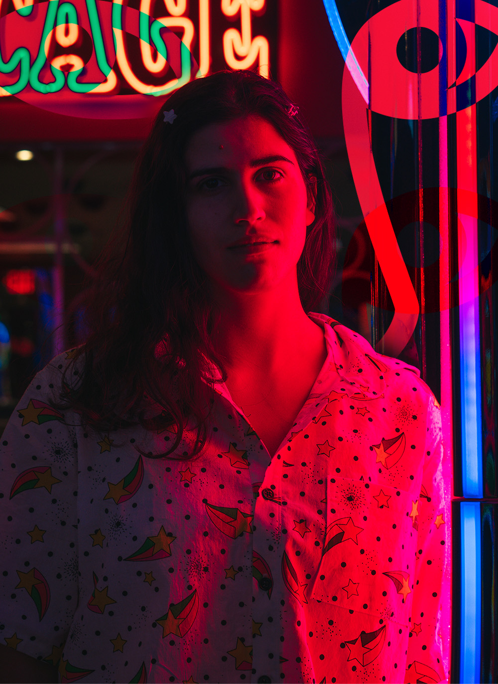
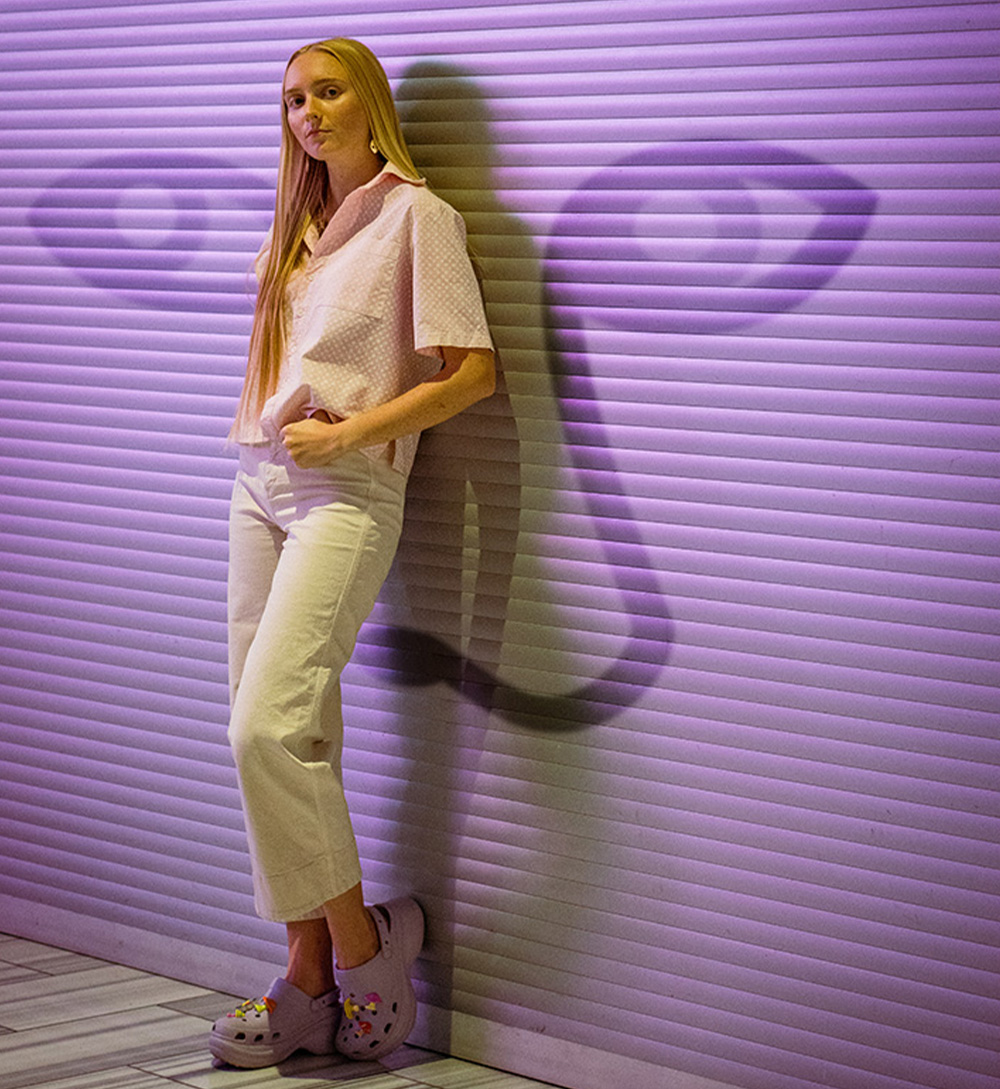
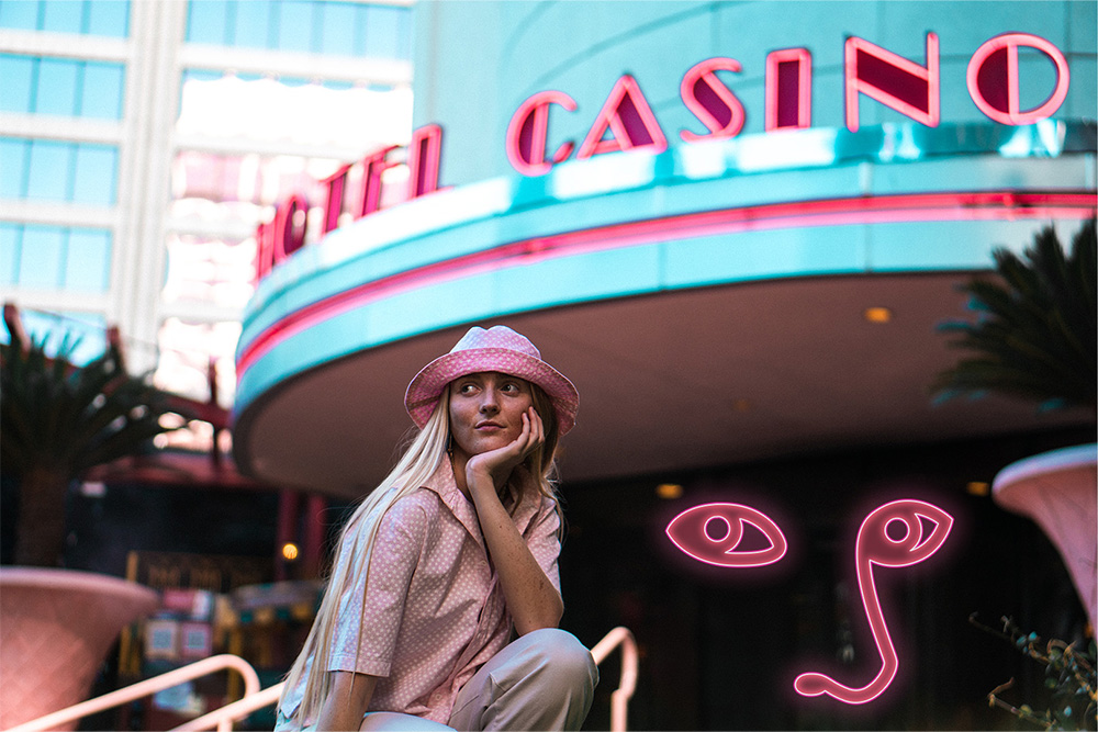
After understanding the goals, people and background of the company, I began looking for pointed inspiration. I was drawn to images and relics of Las Vegas in the 60’s and 70’s, especially after visiting the Neon Museum just outside of the strip. The pastel colors, soft typography, and elegant motifs felt full of character and mysterious allure. A decadent timelessness felt appropriate. Sketches and vectors soon followed.


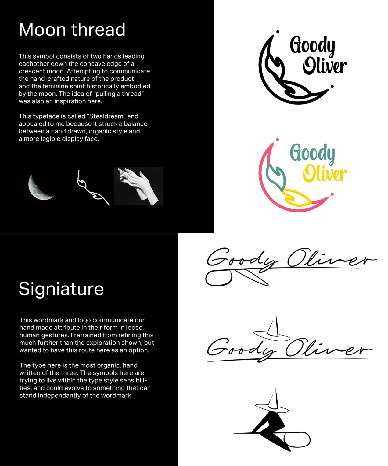
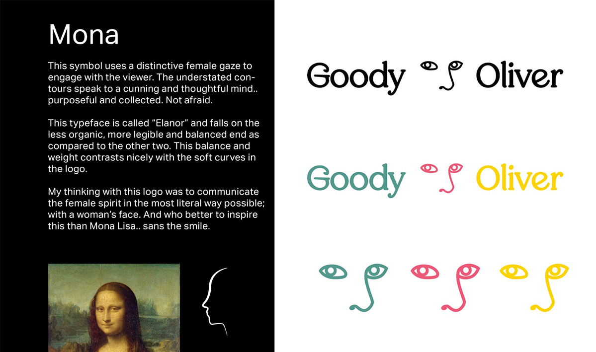
I presented the three most viable options to my client and we settled on the “Mona” mark as the best choice. The recognizable face engaged the viewer with a confident but approachable stare. The “Elanor” font was chosen for it’s balance between ornate and legible lines. The eyes point left while the face right; a nod to the balance between left and right hand path magic, of benevolence and malevolence, of masculine strength and feminine grace.
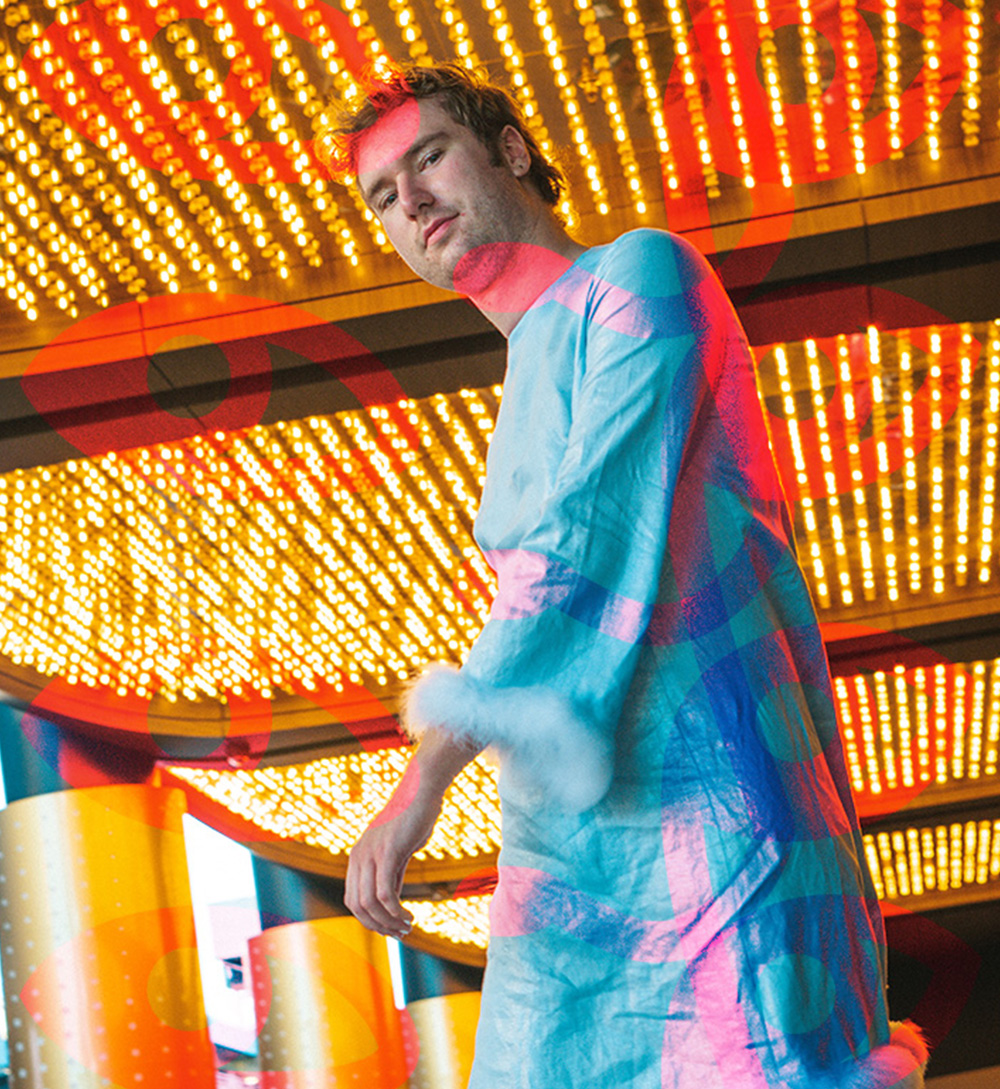
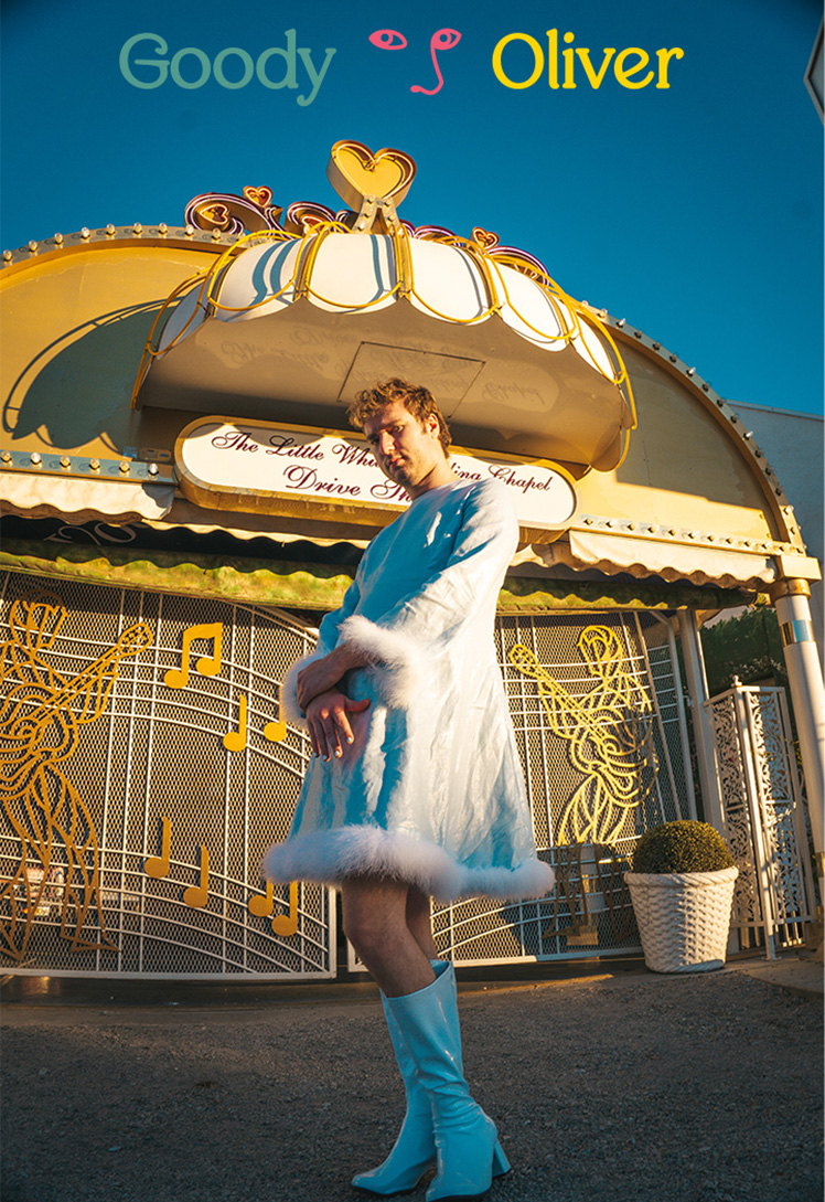
The team was elated with the outcome. We all connected through the project and worked together to bring Goody Oliver to life. We celebrated the launch with a trip to Las Vegas to let loose and capture their summer line in a fitting environment.
Photos by Sage Bennett